Aperture
Luxury Door Brand Identity
The Challenge:
Aperture Luxury Doors, a new start up business, wanted to place themselves in the luxury door market of Cheshire, building brand exposure and awareness across the community.
The Brief:
Create a brand identity and strategy that would help Aperture become market leaders within the space while building a large customer base within the local community. Ensure the branding appeals to a wide demographic of customer whilst stays true to the aesthetic of other companies within the local area.
The Solution:
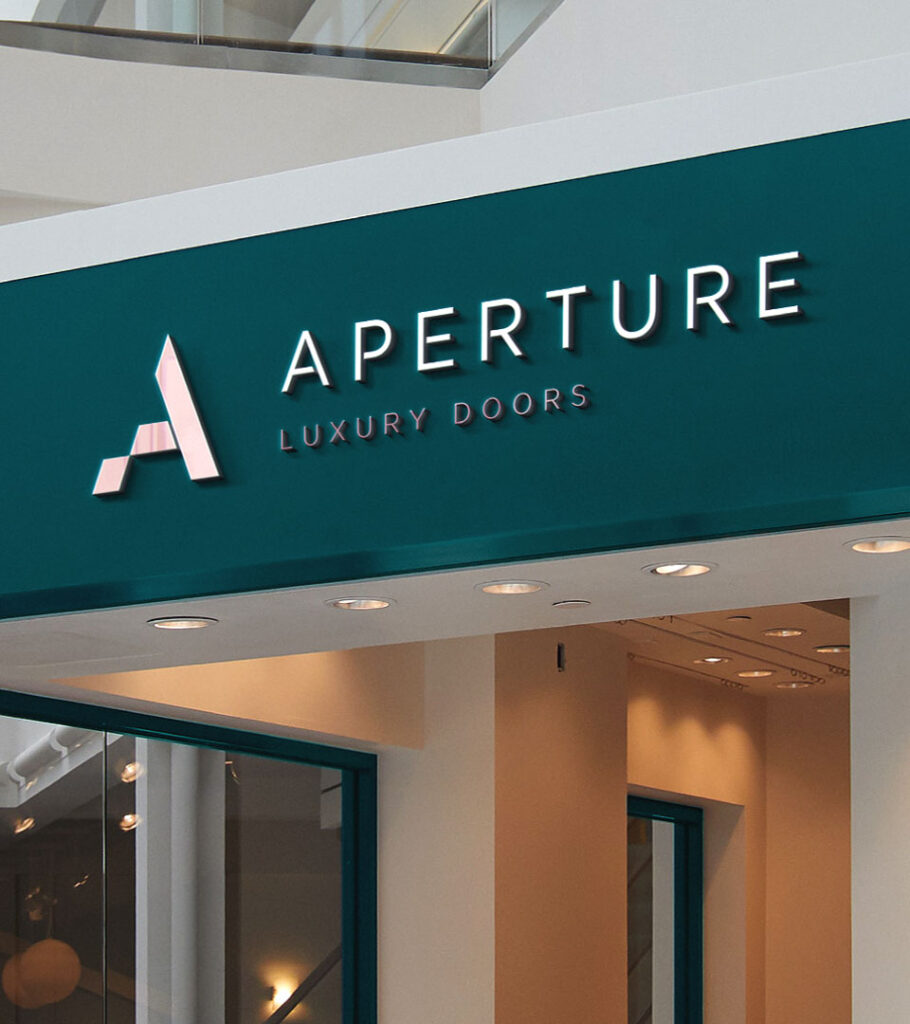
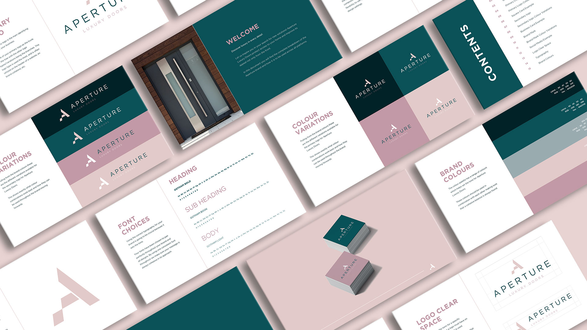
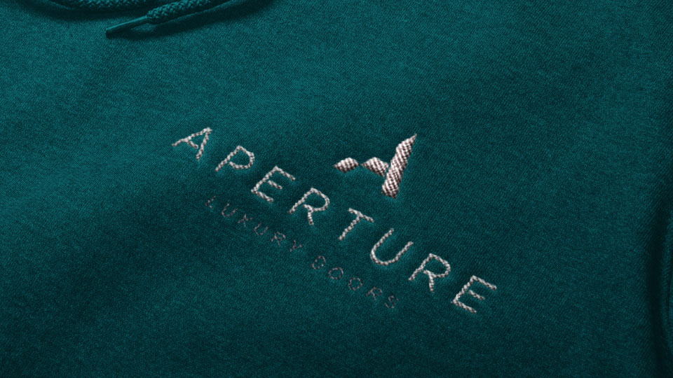
We explored minimalist branding to ensure all messaging was clear, concise, and mirrored the door designs offered. A bold ‘A’ as the focal point ensured the logo was recognisable and also looked as if it was being constructed like a door. We then matched the text up to the brand icon with a minimalist sans-serif font, customised by removing elements of the lettering.
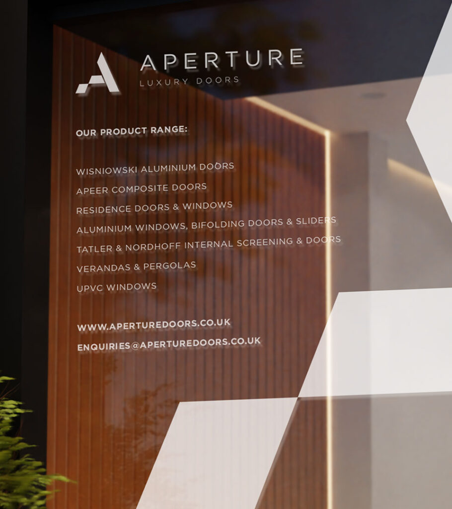
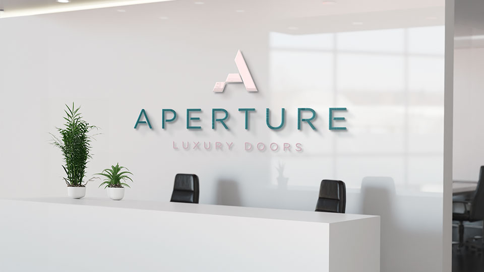
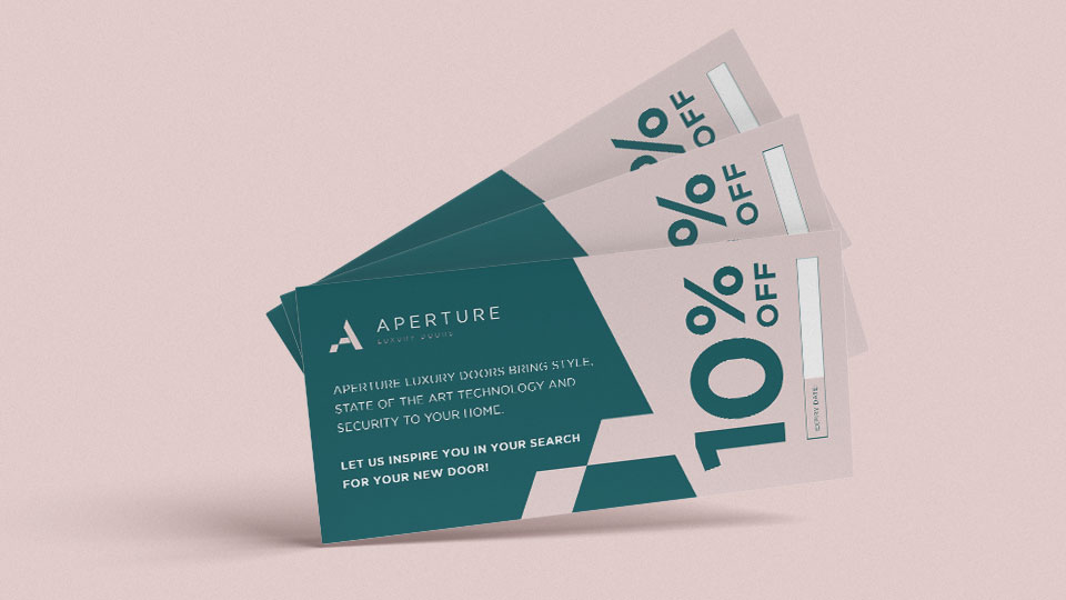
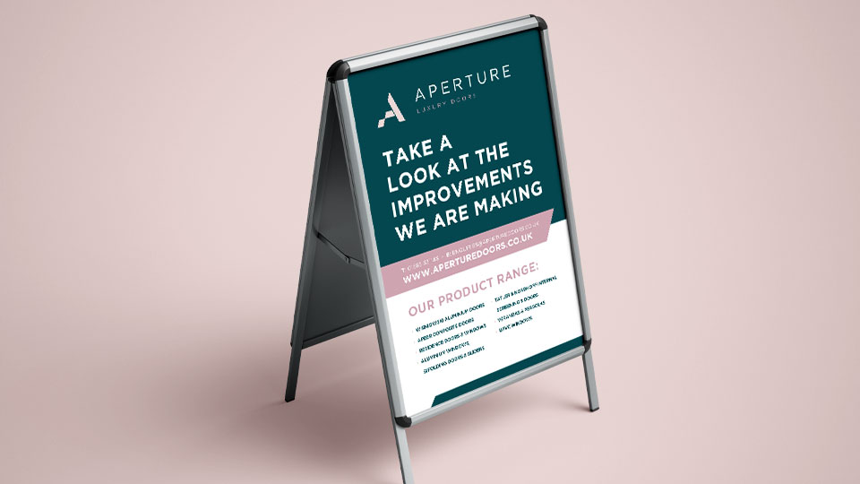
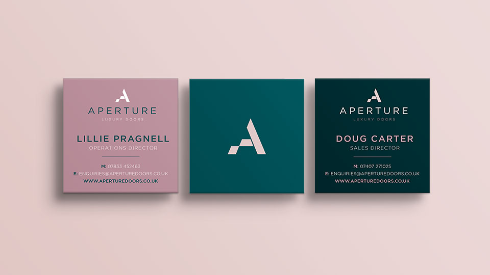
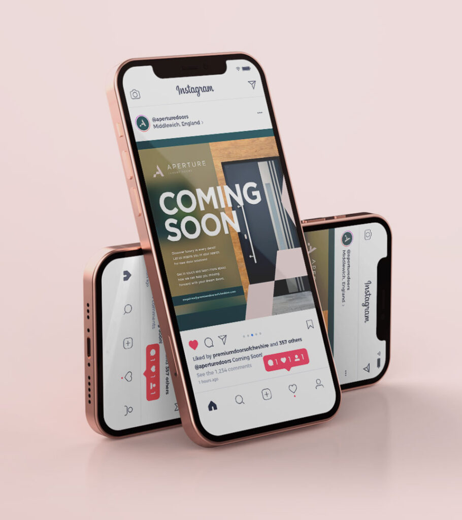
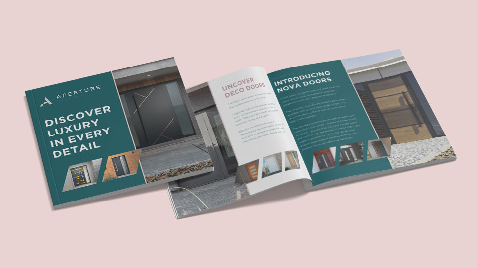
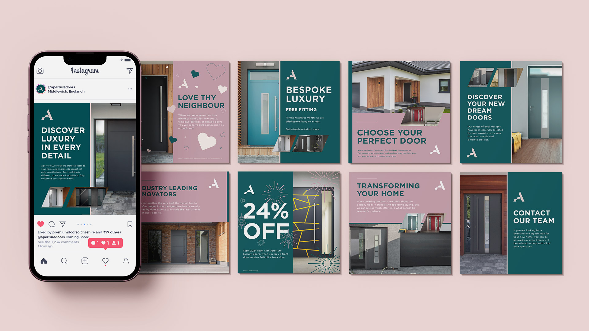
After extensive research and testing, colours of deep greens and pale pinks were chosen to appeal to a broad range of customer and fit in well with the businesses also located on the high street. This new branding was then applied to print, signage and digital touchpoints, including leaflets with exclusive discount offers handed out during the launch period. A social media campaign also launched to connect the brand with both local communities and prospective customers.
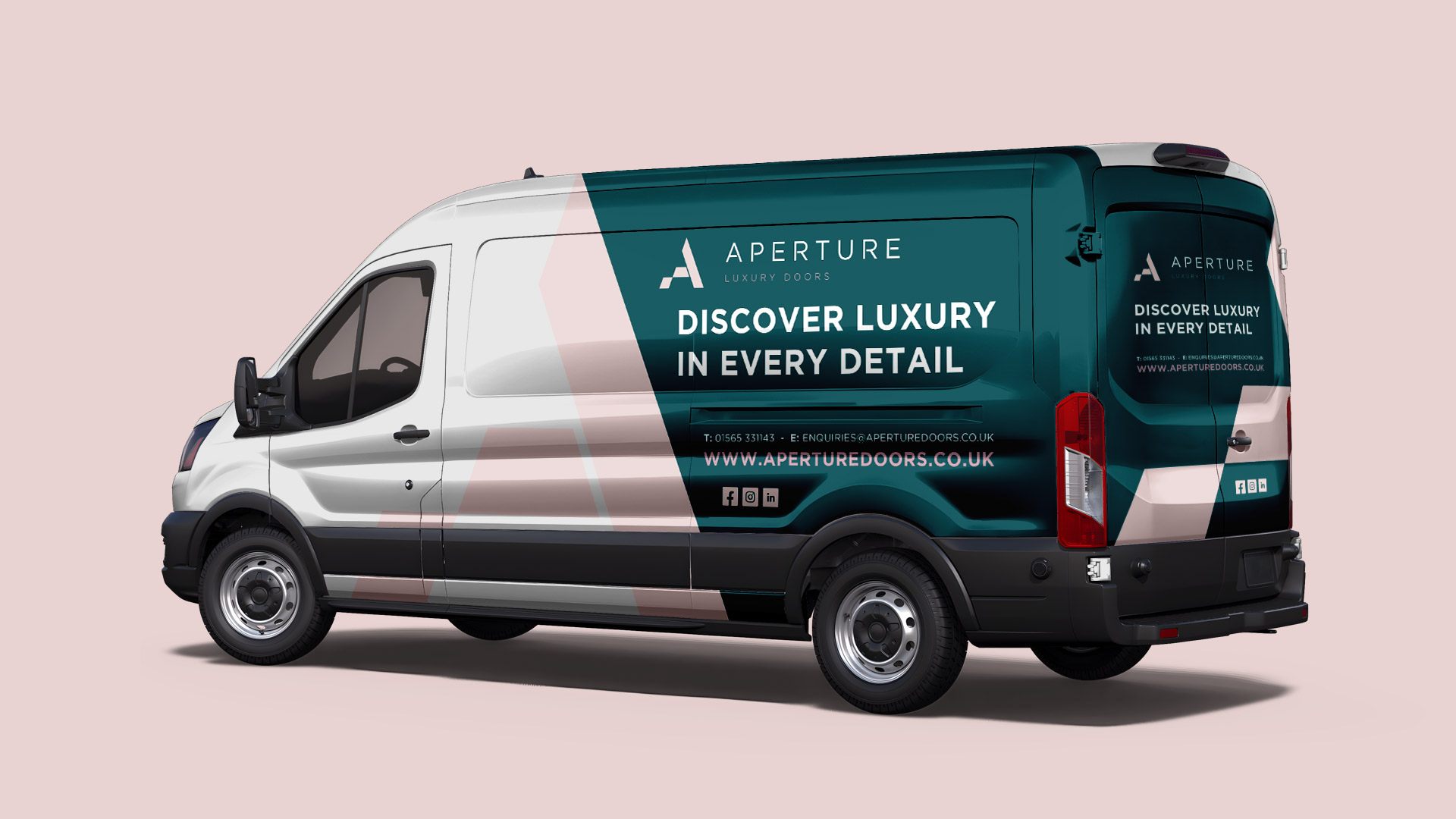
Overall, the brand identity and strategy ensured that Aperature secured their place within the local business portfolio and established themselves as exactly what they wanted to be: a luxury brand specialising in stunning doors.
