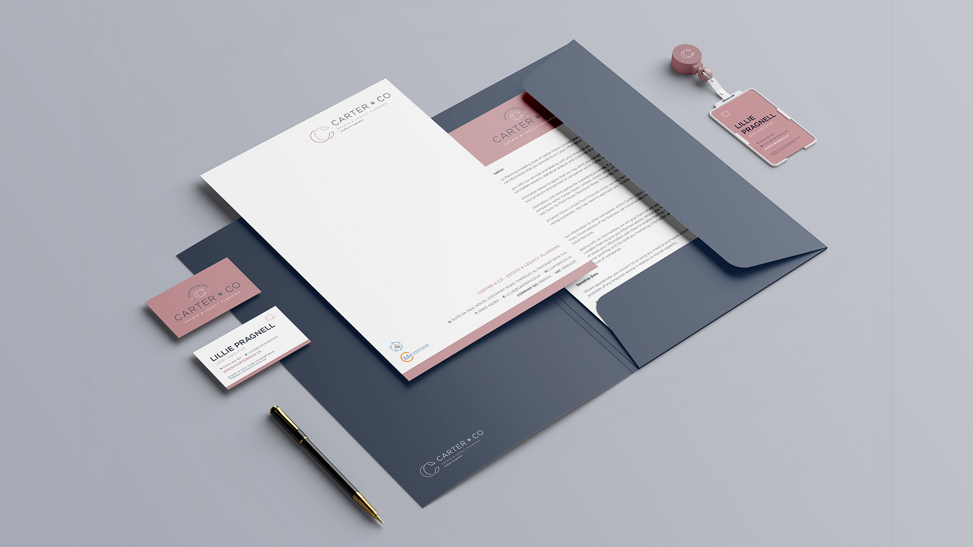
Carter & Co
Solicitor Brand Identity
The Challenge:
As a start up business Carter & Co faced the challenge of establishing themselves as not only experts in their field but also conveying to their audience that they are a heavily female based team that takes care of all their clients, while giving back to various female based charities.

The Brief:
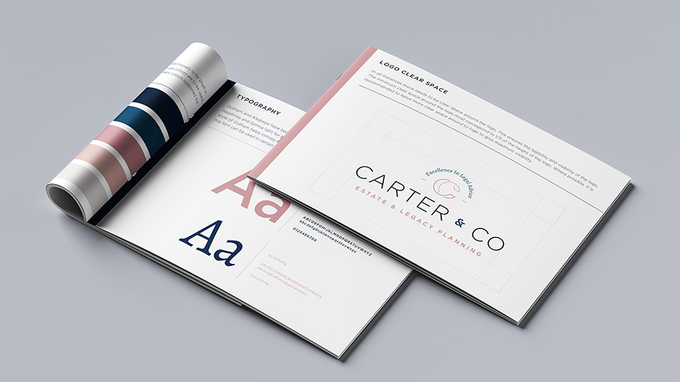
The task was to convey the company’s ethos of ethical standing within the community and delivering an expert service for all clients. This was to be achieved through brand visuals that would work on the various creative touchpoints, including a wide range of print and digital.
The Solution:
After extensive research, the brand creation wanted to focus around showcasing a professional feel to their customers while also subtly nodding to their work with various female charities through the brands colour palette. A fine balance within the brand was needed to make sure male clients did not feel unwanted or that they would not be represented in the right way. The colour palette, anchored in dark tones of blue with vibrant pinks to accent, boldly setting the brand apart in the market and reflecting the brand’s uniqueness. The logo then paired a soft, ethical serif font with a strong, professional, sans-serif font to help create this balance for all customers.
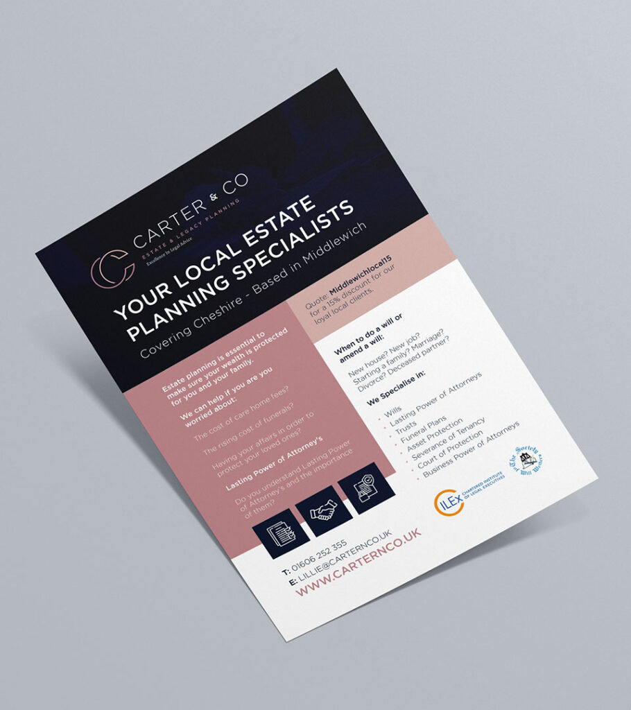

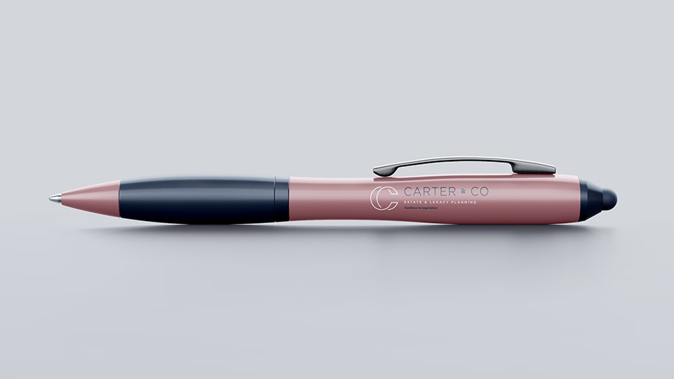
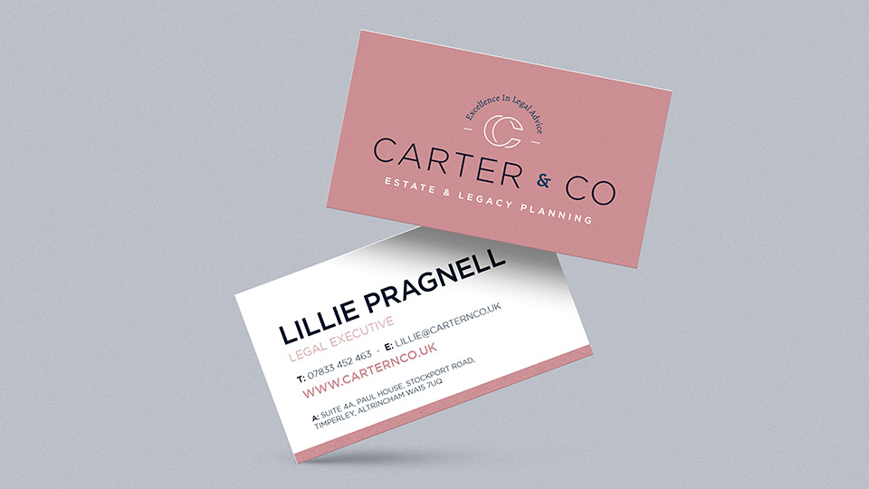
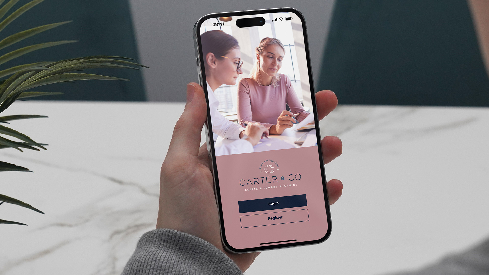
A comprehensive suite of branding materials, with a focus on print was created giving consumers a consistent and coherent feel across all branded items. This then moved across into digital where apps, websites and various other items took the same approach giving a complete and enhanced brand journey.
