Alton Towers Resort
Brand Identity Development
The Challenge:
Alton Towers Resort is one of the most recognisable brands in the UK, comprising of the iconic theme park, exciting accommodations, waterpark and crazy golf. Whilst their brand purpose and essence has remained unchanged, their visual identity needed a refresh for increased effectiveness across the diverse range of channels they activate on, both digitally and in print.
The Brief:
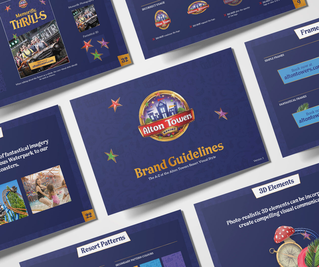
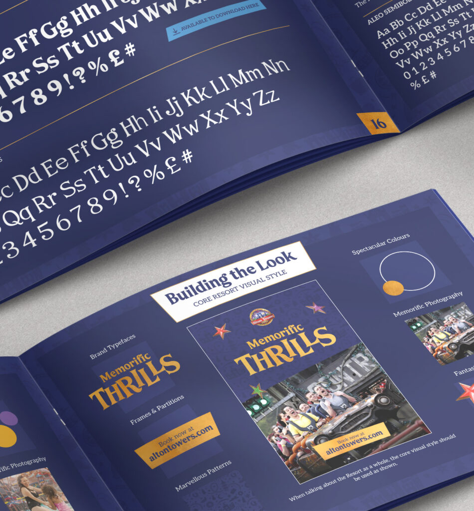
Revitalise the brand’s visual identity with updated brand guidelines, providing adaptability and consistency across all channels whilst ensuring the brand essence of ‘banish the ordinary’ is central to the visual communications, so nothing would feel predictable, yet still familiar to the customer.
The Solution:
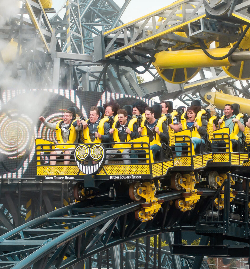
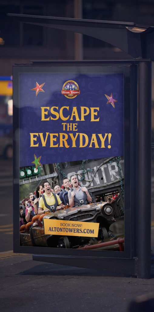
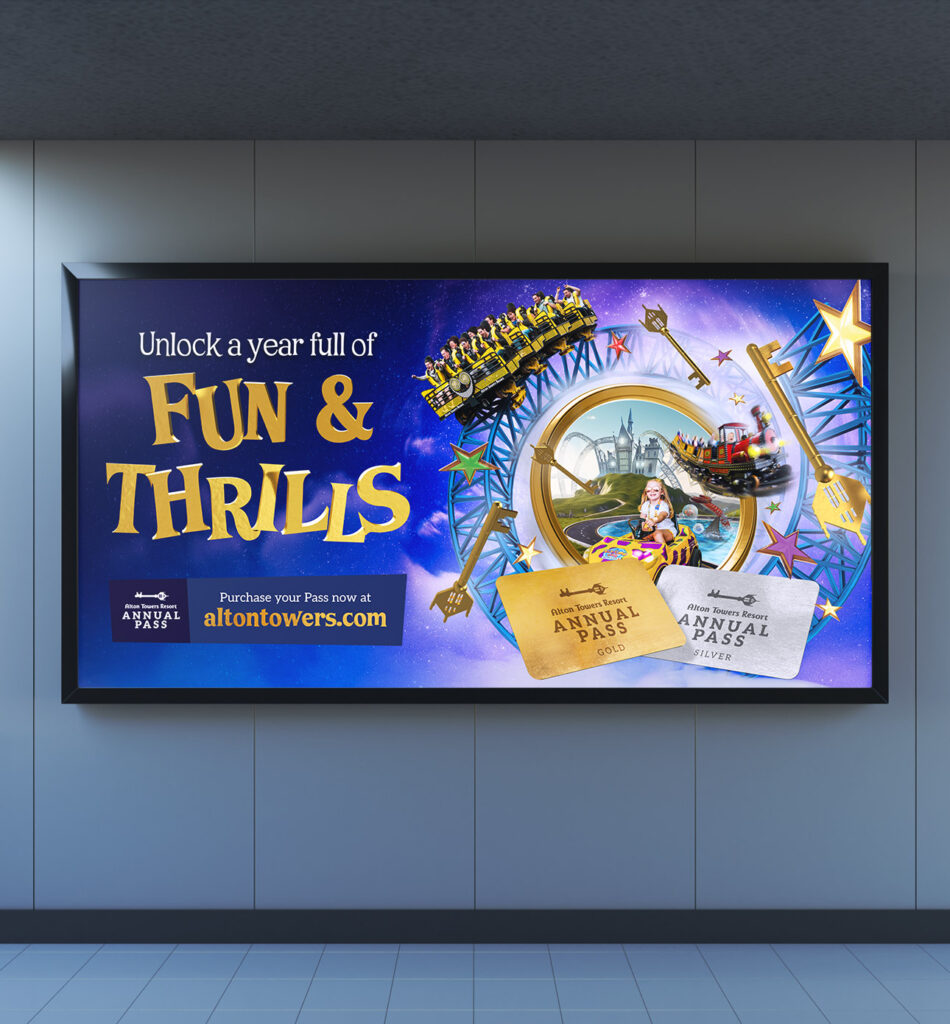
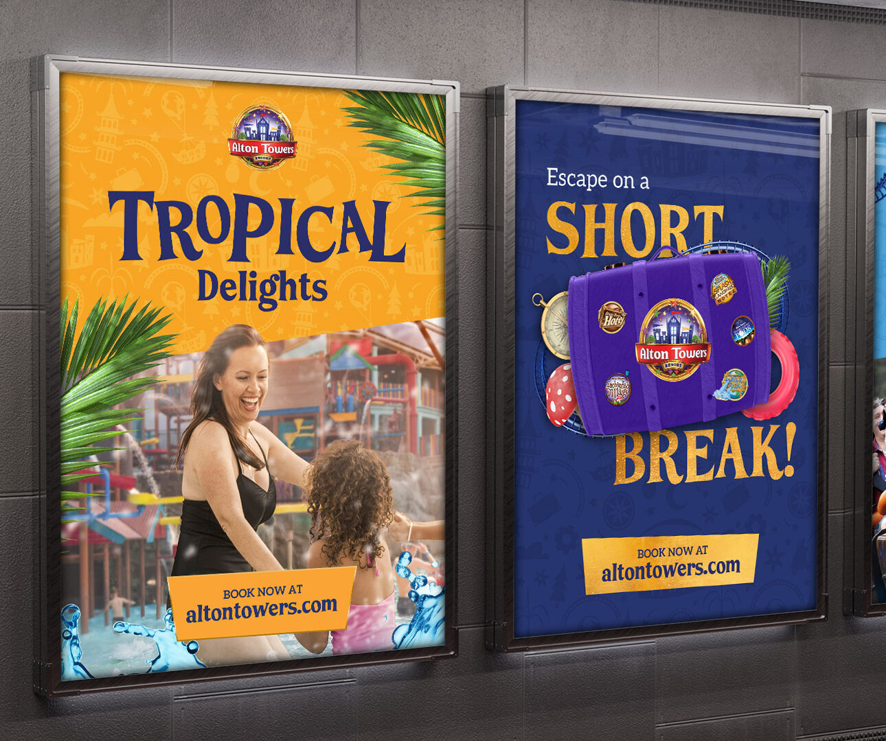
Several elements are incorporated into the updated brand guidelines to refresh to Alton Towers brand. Firstly, engaging and surreal photography are combined with strategic use of 3D assets, to represent the different emotions and atmospheres of the different parts of the Resort, from the excitement of the theme park to the tropical waterpark.
Next, a unique Resort pattern, created by a third-party illustrator to link all aspects of the Resort, is used in the background. Finally, a playful yet edgy typeface, similar but slightly more unpredictable feeling and heavier in weight than the previous font, helps bring to life the message of the communications in a bold and engaging way.
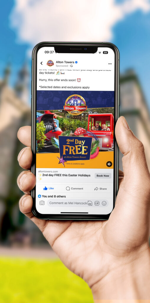
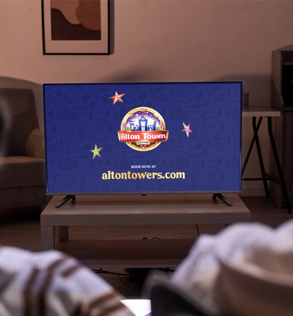
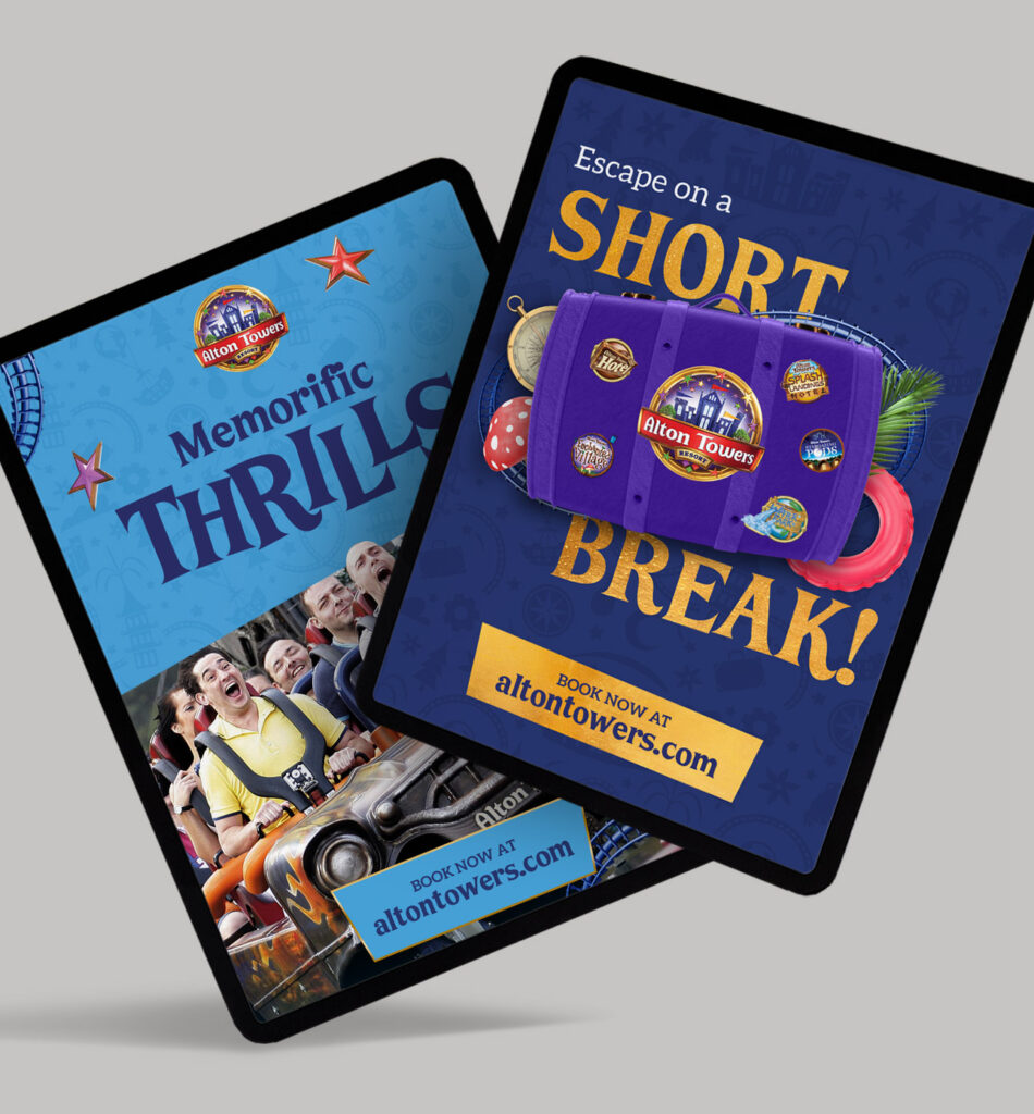
These elements, combined with a striking colour pallet, work together to help bring the familiar brand of Alton Towers into a new, modern era of digital advertising.
