Roosted
Brand Identity & Design
The Challenge:
A new Estate Agency were looking to have cut-through in the competitive and already saturated market. Comprising of housing market experts, they had a wealth of knowledge but were unsure of how to position themselves to achieve this.
The Brief:
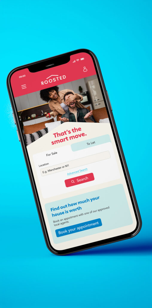
Craft a brand name, identity and strategy, launched with an exciting marketing campaign, to successfully position them in the market. Comprehensive research identified first-time buyers and young renters as the niche the brand wanted to target.
The Solution:
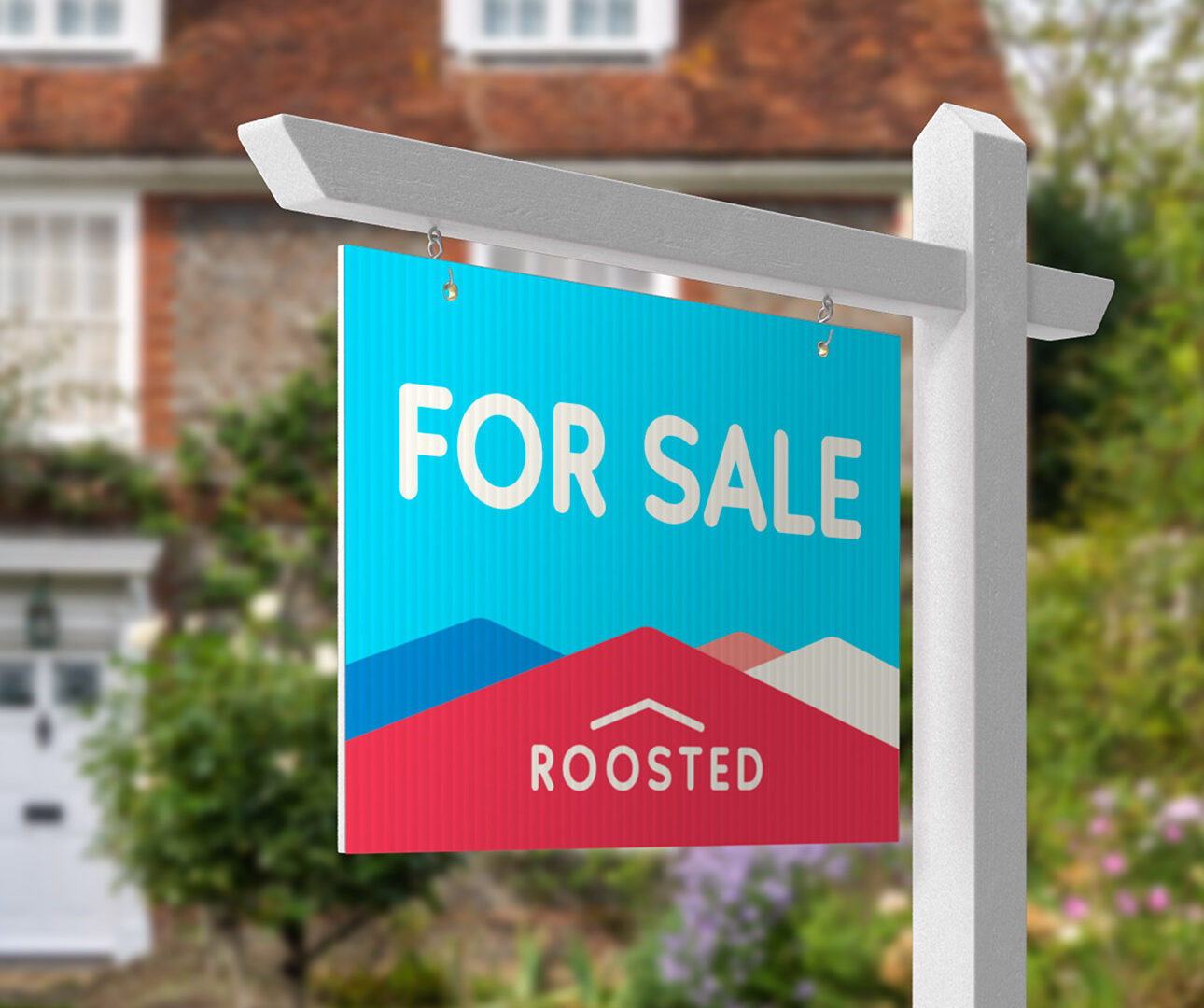
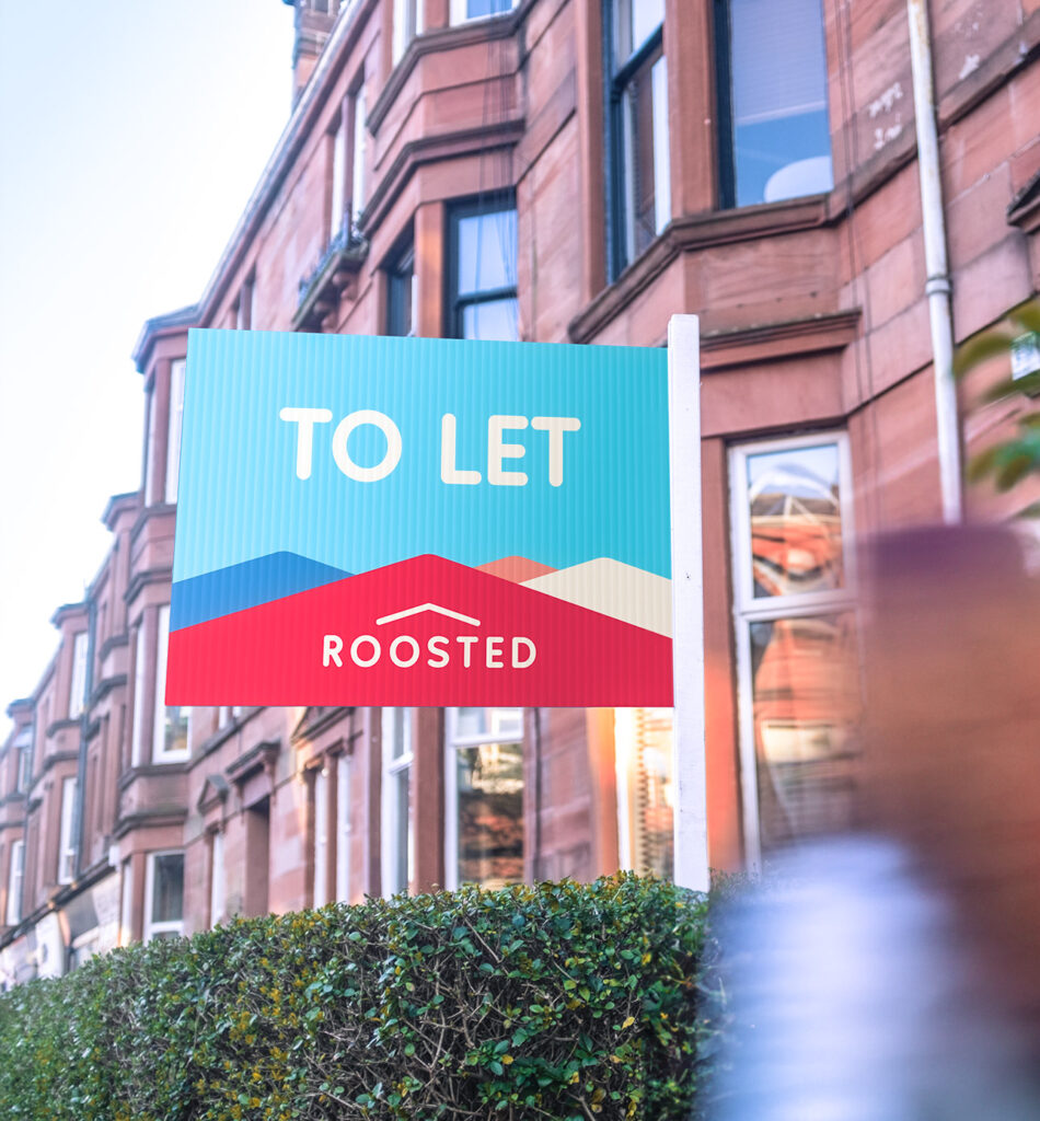
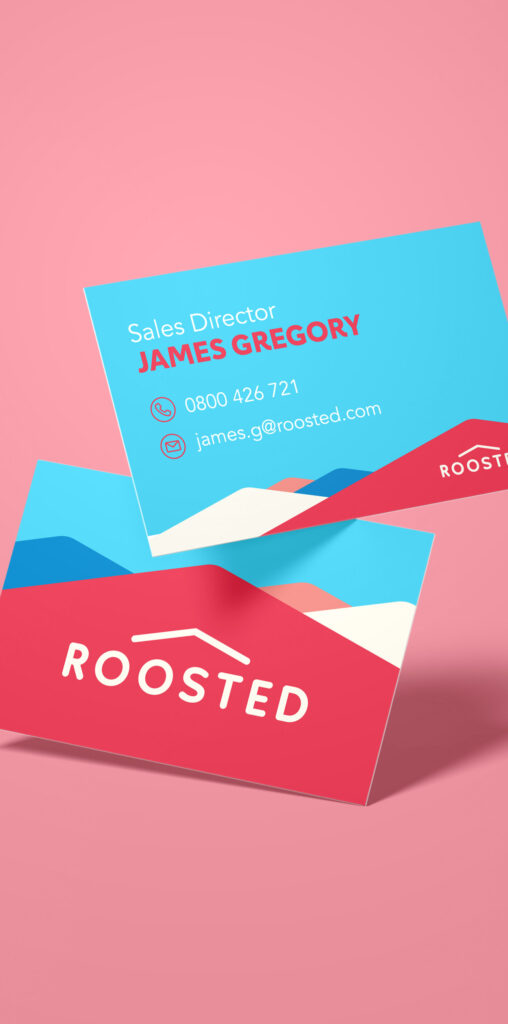
Working closely with the client in workshops and discovery meetings, we crafted the brand values: ‘Welcoming,’ ‘Young at Heart,’ and ‘A Secure Future.’ From these values, the name ‘Roosted’ emerged, striking a balance between playful and serious, symbolizing the security of having a home. The logo, a combination of a wordmark and logo mark, featured a rounded, warm sans-serif typeface for ‘roosted’ and a logo mark resembling an upwards arrow, signifying both shelter and growth.
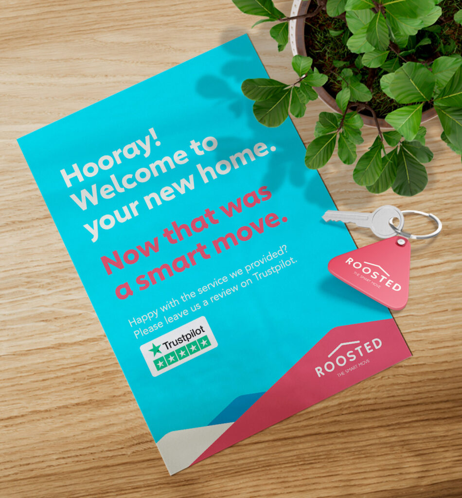
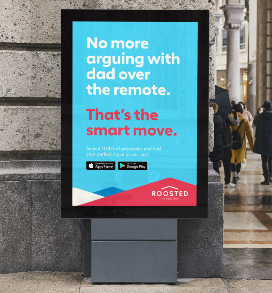
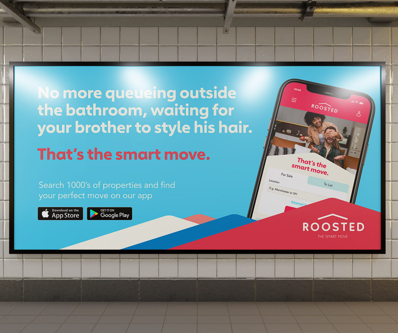
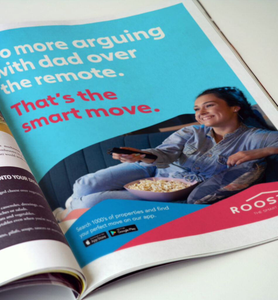
The brand launch campaign extended across social and print advertising, playfully addressing the challenges faced by young individuals living at home with parents and their aspirations to move into their own space.
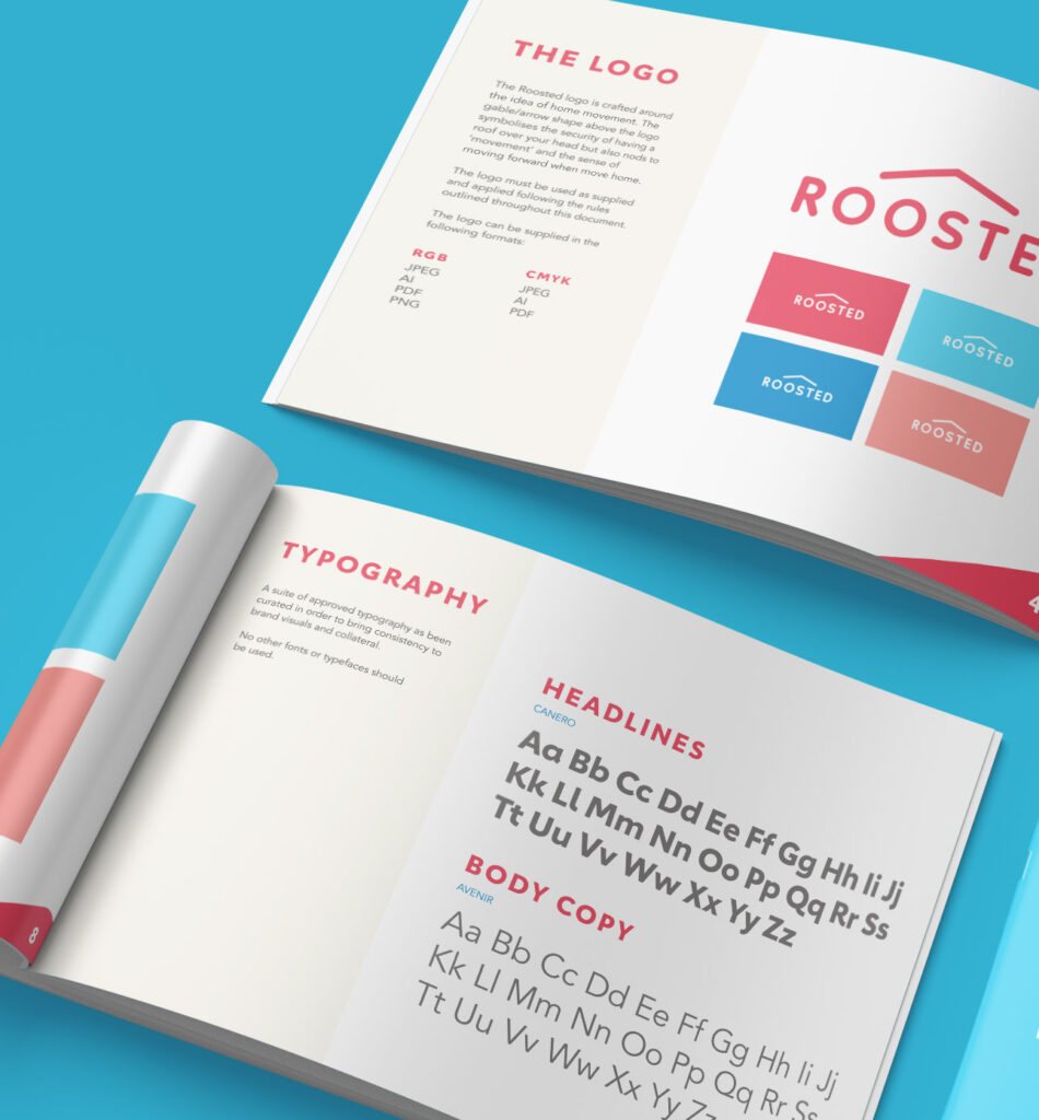
The brand values became the central point of the brand strategy, and allowed us to create a cohesive strategy that the business could live and breathe.
