
Qarlbo
Brand Identity & Design
The Challenge:
Qarlbo, a well established financial advisor, sought to shift their appeal from retired couples to young professionals interested in managing their finances. By doing so, they opened themselves up to a wider, emerging demographic in need of financial support.


The Brief:
Create a new brand strategy and brand identity to support a rebrand of the business, aimed at attracting young professionals while maintaining a connection with existing clients. The brand guidelines needed to be versatile across digital and print formats to engage this new, younger demographic.
The Solution:
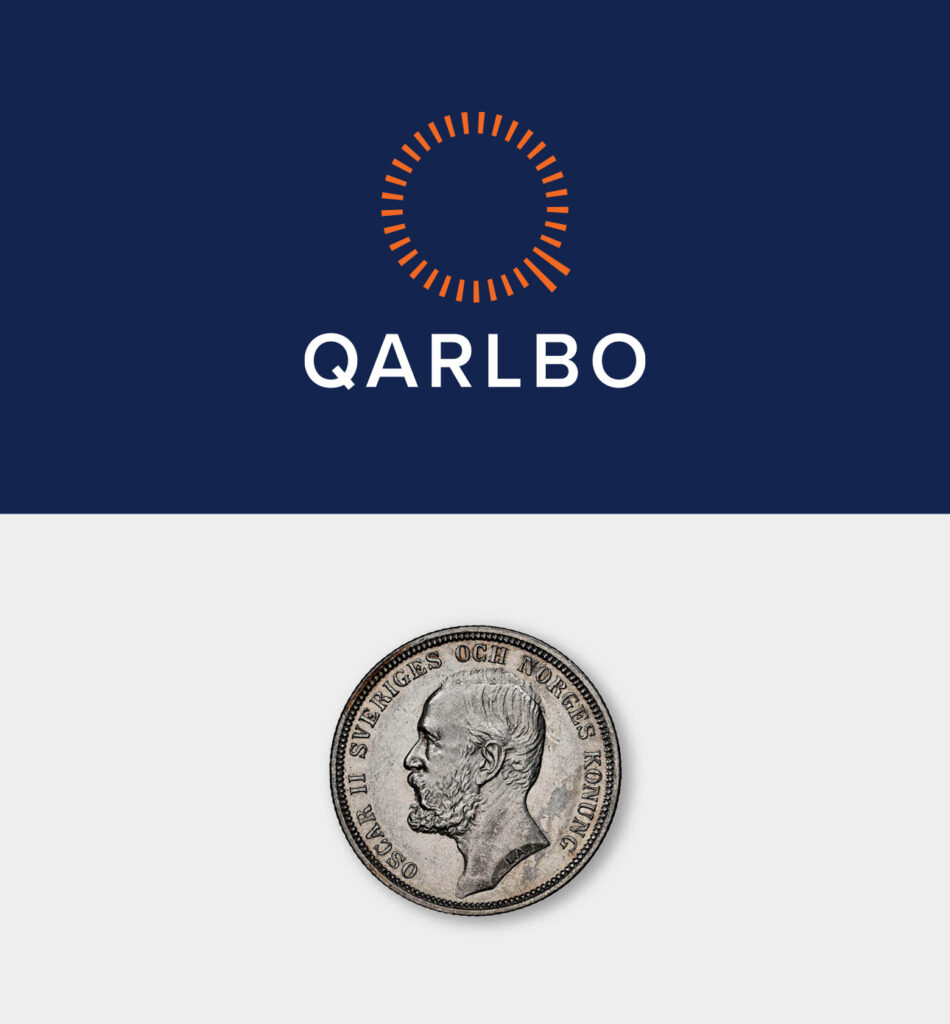
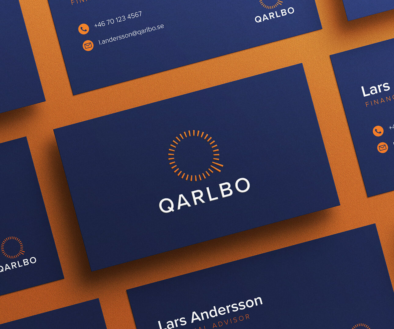
After extensive market research, we crafted a new colour palette—blending a professional deep blue with a vibrant orange for a striking contrast. Complemented by a modern sans-serif typeface, the new logo featured a logo mark with dashes within a circle, symbolizing progress and recalling the brand’s heritage from old Swedish coins. These dashes cleverly represented the ‘Q’ in Qarlbo. To encapsulate the desired client experience, we introduced the tagline ‘Live in financial harmony’.
For the brand launch, various marketing materials were created that featured the brand colours and logo, alongside black and white photography of a composed young lady, chosen to convey the calm and serene feeling associated with financial management from Qarlbo.
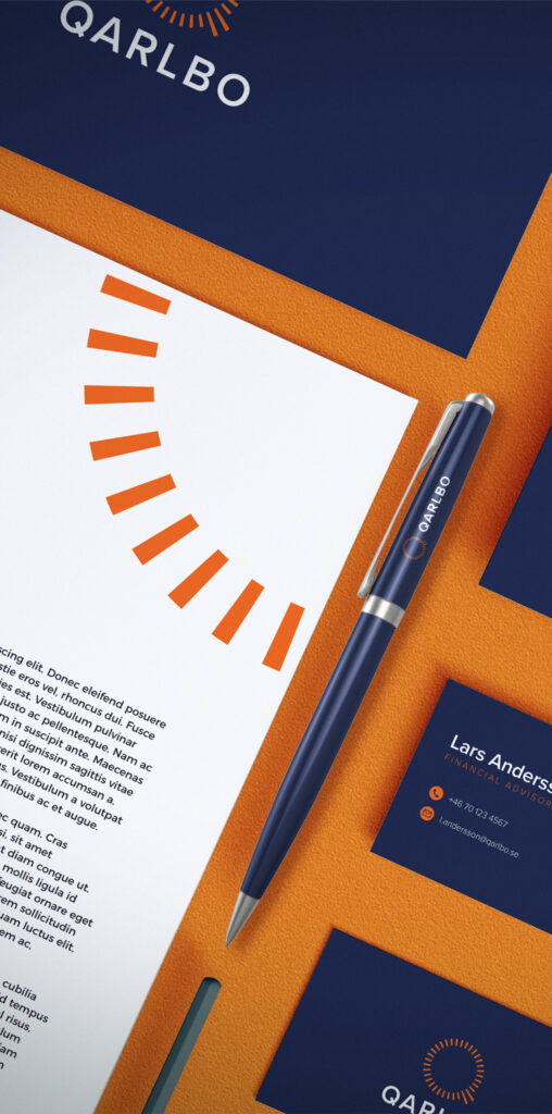

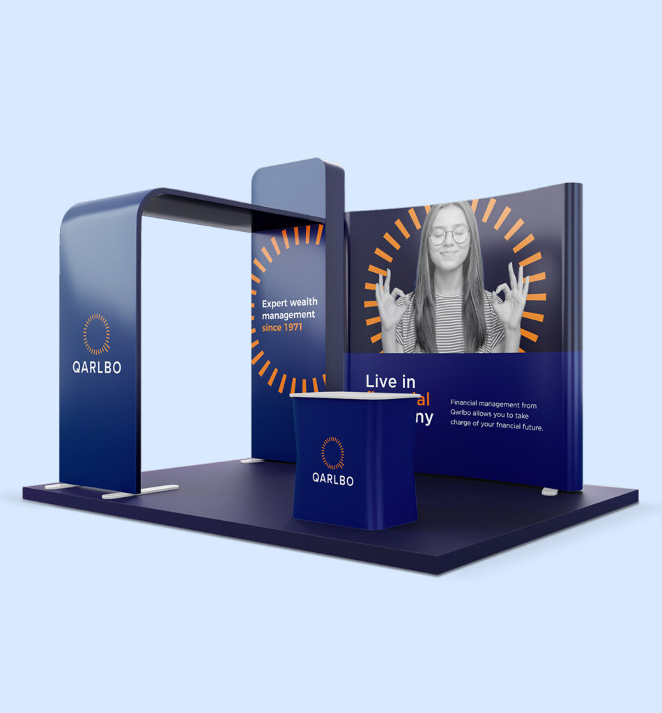
Comprehensive brand guidelines were developed to ensure consistent use of the new, modernised and elevated visual identity, allowing Qarlbo to grow and evolve their communications through new channels to attract the desired target audience.
